Editor
The editor feature-set allows the user to design the application.
Forms
Forms allow you to utilize a simple UI for data entry to your blockchain ledger. It makes using a blockchain ledger even simpler by not having to worry about the structure of data.
When your app is deployed, sample forms will be created for you to use, but you are not limited to just these sample forms. You can create as many forms you need for your app.
Import/Export
You can export a created form to be used either later or on another app. To import a form, simply click on Import and upload your exported forms file.
Add/Edit Design
You can utilize the inbuilt form editor to create or edit a form according to your needs.
- Name: These will be used to identify both the form and the type of records added or modified by the form into World State
- Design Form: Drag-and-drop form elements from the panel on the left or rearrange form elements already on the form canvas to change the layout. You can see the preview of the form immediately.
- For adding nested data, use dot(.) operator in API section of a form element. eg. properties.weight, details.Name, business.address.city, residence.address.city.
- To prevent form submissions upon certain conditions, set data.preventSubmit = true. This can be used in the JavaScript section of any form element. eg. if(data.status !==’Approved’){ data.preventSubmit = true; }
- Identity (signed-in user) context is available as form.identity. eg. if(form.identity.attributes.RoleName !==’Admin’){ data.preventSubmit = true; }
- Smart Contract Function Name (fcn): Select the smart contract function that is for the form submission.
- Smart Contract Arguments: Map each function argument to form fields. You may use any (or multiple) form element(s) as a value or use the special keyword: FormData to save the entire form.
- Key: For XLDB based apps you need to designate a form field that serves as the unique Key for the specific type of records managed by this form. You may use any form element to act as a key, but you can’t change the key once a form is saved. An example of a good form field Key for records type of Vehicle would be VIN because it is guaranteed to be unique. Uniqueness is not required across different forms because form name is always part of the Key as can be visible when observing data entered using the form in World State
- Value: You may use any (or multiple) form element(s) as the value for the key or use the special keyword: FormData to save the entire form.
- Show Save as Draft: Checking this box will allow the app user to save their form in a draft stage before submitting.
- Success Message: You may customize the message shown to the app user when the form is successfully submitted.
- Failed Message: You may customize the message shown to the app user when the form submission fails.
- Submit Button Label: You may customize the label of the form submission button.
Embed
You can use the forms to gather data outside the platform.
- Enable Submission: Enable the form to display outside the platform.
- Embed Snippet: Use the provided snippet to embed the form in your own website.
- Anonymous Submission URL: Share this URL with the end-user to enter data to your form.
Note: If the Identity form element is used in the form, the form cannot be embedded or used for anonymous form submissions.
Pages
Using Pages you configure the interface and navigation that will be shown to the app users. You may create multiple pages for app users, and you may show certain pages to only certain users using Roles. You must create at least one form before you can add a page. To test or preview created Pages, create a role having access to the desired page, then invite yourself as an app user, then switch to runtime console (left sidebar).
- Name: The name of the page.
- Show Records: Filter the data shown to the app user.
- My Records: Display only records created by the signed-in user.
- All Records: Display records created by any user.
- Data Source: Select the data to be shown to the app users. Select from World State / custom label or Transactions. For most use cases you will use World State. When Transactions is used, it shows the history for changes to the World State.
- Query: Set rules to filter the data shown to the user.
- Add Operations: Drag and drop Operations (Forms) to Add Operations panel. This will allow users to add new records using the form by placing an Add button at the top section of the page.
- Context Operations: Drag and drop Operations (Forms) to Context Operations panel. This will allow the form to be used as context action for existing records. In the runtime console, context actions are accessible at the end of the row under the Actions menu. Examples of context actions are modify, delete, transfer, view, change status.
- Read-only: Selecting this would not allow the app user to make any changes to the data from the form. To support Modify and View Only using roles, drag the context action twice, designate one as View the other as Modify, set the View as read-only and control access using Roles.
- Fields: Drag and drop Fields which should be visible to the app user as records columns.
- Searchable: Selecting this will enable searching for the field at the top section of the page.
- Header Text: Customize your page by providing description/instructions for the app. This will be shown at the top section of the page.
- Footer Text: Customize your page by providing description/instructions for the app. This will be shown at the bottom section of the page.
- Navigation Icon: Customize your page by providing unique and helpful icon for each page.
- Page CSS: You can customize the look and feel of a page by overriding CSS classes. Click Use Sample button to check how you can make CSS changes.
- Number of Items Per Page: Provide the number of items that must be fetched in a sinle page. If more items exist, those can be fetched in the next page.
- Menu Weight: Pages are ordered left to right in the navigation menu using weight.
Workflows
Workflows allow you to design and execute the flow of data in an application. A set of actions can be configured based on multiple conditions. These actions will get triggered as the workflow progresses and conditions are passed.
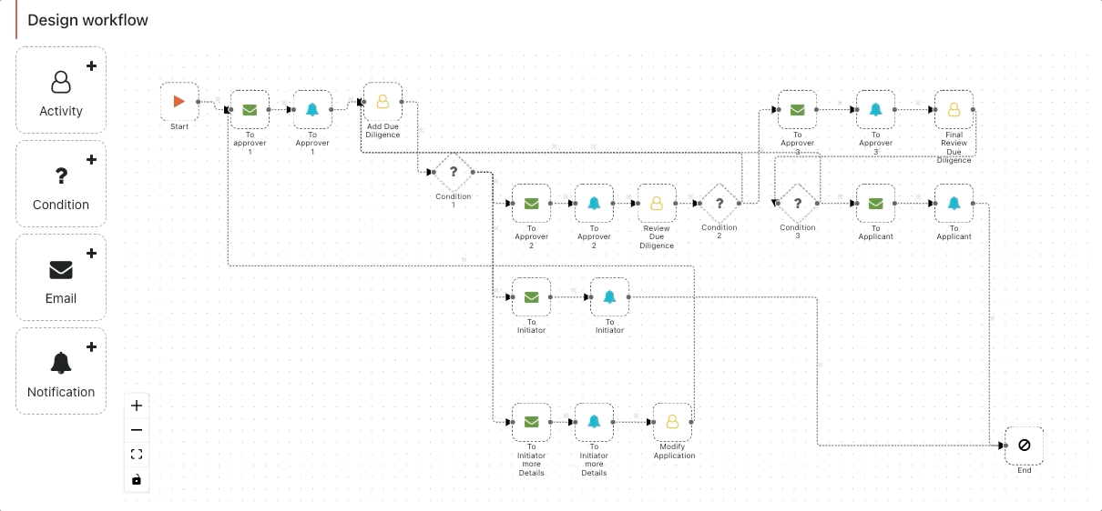
To create a workflow:
- Click Add New.
- Drag and drop an Activity, a Condition, an Email, or a Notification component to the designer.
- Connect the components to form the workflow. Each workflow should begin from the Start node and conclude at the End node.
- Configure the added components by clicking on each respective components:
 Start: This is where a workflow always begins from. You will be able to configure the workflow trigger settings from this component. There can only be one start component.
 - Initiator: Choose from an app’s defined role(s) in this section. The users with the selected role will be able to trigger the workflow. This is an optional field.
- Document: Select the form that will trigger the workflow. This is a required field.
 Activity: Any user activity can be configured from this component.
 - Details
- Record View Form: Select the form that will be used to view the record.
- Assigned To: Assign the workflow to an app role. The users with this role will be able to modify the record.
- Activity Form: Select the form that will be used by the user to perform an activity. In the runtime console, Activity Forms are accessible at the end of the row under the Actions menu. Examples of Activity Forms include modify, delete, transfer, view, and change status.
- Reminders: Enabling the reminders will send an email to all the users assigned with the role(s) of the activity. This will remind users for the action to be taken by them.
- Execute: Configure the interval between reminders. You can select to remind once or until the user performs the action.
- Subject: Subject of the email. You can add various placeholders as well.
- Body: Body of the email. You can add various placeholders or format the text.
- Details
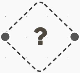 Condition: All the connected nodes will be visible in the settings.
 - Transition: Configure conditions for each transaction node that will trigger the proper next step in a workflow. For all workflows where no condition is passed, the workflow will remain with the existing node.
 Email: This component will send an email to a role or an actor.
 - To/CC/BCC: Select a role or an email Id to whom the email will be sent to.
- Subject: Subject of the email. You can add various placeholders as well.
- Body: Body of the email. You can add various placeholders or format the text.
 Notification: This component will send a notification to a role or an actor on the Xooa platform.
 - To: Select a role or an actor to whom the notification will be sent to.
- Heading: Heading of the notification. This will be shown in bold.
- Message: Details of notification.
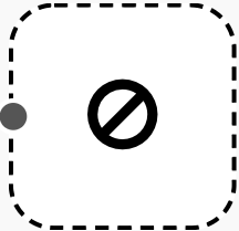 End: Every workflow must end at this component. There can only be one End component.
 - Record View Form: Select the form which can be used to view the record.
- Visible To: Include the app roles in this section. The users with the selected role will be able to see the completed workflows.
Monitoring: You can view the complete audit log of a workflow. You can filter based on Record Id or sort based on timestamp.
You can also trace the activity from the monitoring logs.
Dashboard
Visualize your data in the form of charts or tables. Adjust the metrics according to your requirements and personalize your dashboard for each app. You can also export the customized data in the form of CSV.
You can view all your charts and tables under this tab.
Click Add Element to add another chart or table to the dashboard. For each new element, you can define the settings to fetch data and populate the dashboard element.
You can configure the following settings for each dashboard element:
Field
Fields defined in the Manage Schema tab can be used here. Several pre-defined transactions and state-related fields are available by default.
Fields are the dimensions that you can add and use in your dashboard elements.
Measure
Measures defined in the Manage Schema tab can be used here. Transaction Count is available by default.
Measures are the aggregations that you can define and use in your dashboard elements. The aggregation can be defined on the fields and existing measures.
Time
Transactions Created and State Created time along with any field defined with data type as timestamp can be used as a dimension of time.
Filter
You can filter the items based on Fields, Measures and Time. This will allow you to limit the data points on which the dashboard element will be created.
Chart Type
You can select the chart type for your dashboard element. Your available options include Line, Area, Bar, Pie, Table, or Number as a chart type for your dashboard element.
Dashboard Schema
Field
Fields are the dimensions that you can add and use in your dashboard elements. You can either add from the suggested fields or as a custom field. The suggested fields are based on the last 25 transactions on the app and forms.
- Label for the field will be shown in the dashboard element.
- Field is used to map the value field of the world state to a dashboard element.
- Enclose the key of the world state in {{ }}. PostgreSQL syntax can be used in Field. eg. EXTRACT(month FROM age(TO_TIMESTAMP({{loanApprovedDate}},’YYYY-MM-DD’),TO_TIMESTAMP({{xldb_createdDTM}},’YYYY-MM-DD’)))
- Standard fields (such as Transaction date or State last-modified-date) are always available for Measures and Dashboard elements and do not need to be added.
- Quickly add fields using suggestions, which are offered by the Xooa AI. To train or retrain the Suggestions AI, invoke new transactions or directly write to the World State (if using XLDB).
Note
Define the correct Data type of each field. This step is necessary to avoid any inconsistencies.
Measures
Measures are the aggregations that you can define and use in your dashboard elements. The aggregations can be defined on the fields and existing measures. Several types of aggregations are available viz. Average, Sum, Number, Count, Count Distinct, Count distinct approx, Min, Max and Running total.
- A complex query can also be written while defining aggregation queries. eg. COALESCE(student_age (field),0)+COALESCE(employee_age (field),0).
- Filters can also be added to the aggregation query. eg. employee_type (field)=‘sales’.
- PostgreSQL syntax can be used in Value Field.
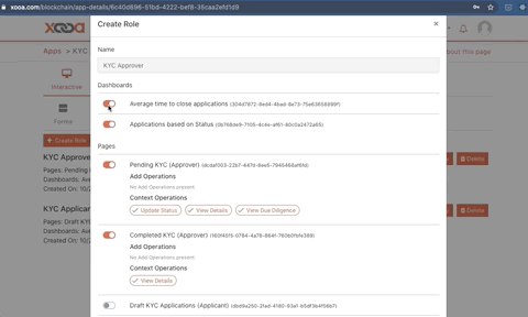
Roles
App roles can be defined for different entities using the app. You can provide access to select dashboards and pages for an app role. The app user will have access only for the pages and dashboards selected in the app role.
- Dashboards: Toggle select the dashboards you want to be visible to users associated with the role.
- Pages: Toggle select the pages you want to be visible to users associated with the role. Further select the forms to be accessible to the users.
- Workflow Monitoring: Check this field to enable the role to access workflow monitoring logs.
- Admin:
- User Management: Check this field to enable the role to access, add, edit and delete app users.
- App Design: Check this field to enable the role to customize the app.
Users
You can invite other users to your app. It also allows you to provide access based on roles for the app user. This is best suited for apps involving multiple entities using the app in the workflow. The shared user will have read access to the data accessible based on roles; however, they can only make changes if the appropriate form has also been shared with them. The app user will be able to access the shared app in the runtime console.
- Name: Provide the name of the user to be invited.
- Email: Provide the email of the user to be invited. The user will receive the invitation on this email. The user also has to log in to the platform using the same email.
- Roles: You can provide one or more roles to the user. Select a role from the dropdown.
- Additional Attributes: You can provide additional attributes for a user. These attributes can be accessed in forms, pages and the smart contract.
Publish
This allows you to customize the user interface of your application for the app users.
- App Logo: You can upload your logo to be visible to the app users while accessing the app.
- App URL: This option provides you with an application URL. You can share this URL with the user to allow him to access the app and take the user to log in screen.
- Signup URL: This option provides you with an invitation URL. You can share this URL with the user to allow him to access the app and take the user to sign up screen.
- Self Signup: Enabling This feature provides you the ability to invite users without configuring them yourself. Anyone with the App URL/Signup URL can access the application. Proceed with caution when sharing App URL/Signup URL if this setting is enabled.
- Invitation Email Template: You can customize the email that will be sent to the app user when you invite the user for accessing the app.
- App Terms and Policies: You can specify your custom terms and policies that a user must adhere to before accessing the app.
- SEO: You can set your custom favicon, title, and description of the runtime web app.
- Custom CSS: You can customize the look and feel of your application by overriding CSS classes. Click Use Sample button to check how you can make CSS changes.
- Localization: Provide multi-language capabilities for your application. Click Use Sample button to check format required for localization.
World State
World State provides:
- Access to the state database of the app.
- Ability to search the state database using a key or value.
- Check the history of values for the associated key from the World State.
- Create, modify, or delete the key and its associated value from the World State (for XLDB only).
Transactions
The Transactions tab allows you to browse activity in the ledger. You can:
- Browse through the history of transactions
- Search and filter the transactions by key, value, transaction ID, and date range
-
Key
The key used to save the data in the ledger.
-
Value
The value saved in the ledger.
-
Is Deleted
Denotes if the transaction was to delete the value from the ledger.
-
Updated At
The time at which the transaction was made.
-
tx ID
A unique transaction ID of the current transaction.
-
API
Sandbox
-
API Endpoint
Endpoint for calling functions in the smart contract.
-
API Documentation and Testing
URL for testing API endpoints. You can also test smart contract function calls.
-
API Explorer
Test the API endpoints for the smart contract upon authorizing use for the identity API token.
Monitoring
The history of API calls that have been made to the app filtered by the date range specified.
-
Time
The time at which the API call was made.
-
Method
Request method for the API call.
-
Path
The endpoint called.
-
Response time
The time taken to get the response for the API call.
-
Response code
The response code received by the user for the API call.
-
Client IP
The IP address from where the API call was generated.
-
Identity ID
The Identity used to make the API call.
Identities
An identity is someone with an API token and a given set of permissions to access the APIs for the app. From the Identities tab, you can perform actions such as:
- Add identities
- View identities
- Delete identities
- Update identities
- Regenerate an API key for an identity
-
Identity ID
A unique identifier of the identity. This is not the API token of the identity.
-
Name
A descriptive name for the identity. Notice that the name does not need to be unique.
-
Access
Determines if an identity with the API token can only read the ledger or also write to it.
-
Manage Identities
Determines if the API token for this identity authorizes them to create other identities. Typically, such an identity represents an administrator.
Note
An identity authorized to manage other identities can always create identities with write access to the ledger.
-
Token Generated On
Local date and time for when a token was last generated for the identity.
-
Actions
Perform actions on the identity such as:
- View: View the identity details such as access permissions and public key.
- Regenerate: Generates a new API token and revokes the previous token.
- Update: Update the access permissions of the identity.
- Delete: Deletes the identity and revokes its API token.
Logs
View smart contract logs from the last 10 minutes. What events are logged depends on how you have coded your smart contract. Click here for details on Hyperledger Fabric’s logging. The logs are available only for custom smart contracts which are deployed on Hyperledger Fabric.
Details
App Info
Get all the details about your app including the name, description, and ledger details.
Activities
Provides a history of activities related to the app. Activities include information about redeploying the app, app-specific actions, identity-related actions, and upgrades.
Manage
Delete your app from Xooa, manage the endorsement policy, or update your app from your GitHub repository or local directory.
Delete App
Deleting the app will remove the end points and the smart contract from Xooa. This operation is irreversible and you will never be able to access the app data again on Xooa.
Multi-language Support
Multi-language support is available for the runtime console. You can provide the runtime user interface in any language. To avail of this feature, get in touch with the Xooa sales team.